


Transit maps are hot right now – a phrase that I never expected to write. Rapid transit simulation games like Mini Metro win awards for “Excellence in Visual Art” and “Excellence in Design.” [1]

Artists now create fantasy metro maps for entire regions or minimalist versions of existing systems to sell as home and office décor. While the latter are pretty to look at (I have three in my office), their simplification erases their utility as a means of navigation; they are monochromatic lines on a blank canvas.
The official fixed rail transit maps in the United States sometimes don’t do much better – the lines are differentiated, stops are added, and maybe even a river or park is thrown in for large-scale context – but they still show a transit system floating in a void. These maps do a great job of making the system easy to understand once you are on it, but lack context. While many agencies do have maps that provide more context – typically in the form of a bus map that also shows the rail lines – those are not as ubiquitous and widely distributed.
Use of maps for station access
The typical metro or subway system maps lack what I call pedestrian legibility – the ability of the average city dweller to understand how to access their transit system on foot. Maps like this are great for understanding where lines generally serve and how they intersect, but provide little to no context on how to navigate to a station, or if two neighboring stations are a few blocks or a few miles apart.
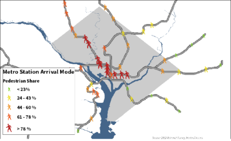
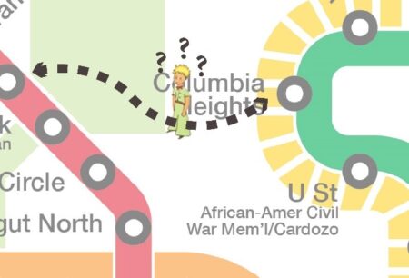
For example, while the highly-regarded and extremely well-designed WMATA rail map’s simplicity makes the system itself easy to understand, it doesn’t help users understand how to access the system. In this example diagram, the pedestrian’s location between Columbia Heights and Cleveland Park stations is riddled with uncertainty – are these stations ½ a mile apart, or two? What street would I walk down to find the station? Is the park easy/safe to cross on foot? The lack of pedestrian context creates more questions than answers, ironic in a city that is considered one of the most walkable cities in the United States.[2] In fact, the Washington Metro’s ridership base is full of pedestrians – for stations located within the District itself, over 70% of users arrive to take the train on foot. For many stations in Downtown and Northwest DC, the pedestrian mode share is closer to 80% or higher. WMATA’s Metrorail system clearly depends on pedestrian foot traffic and ridership, yet the official Metrorail map that is ubiquitous throughout the system does little to cater to this vital cohort.
How can maps be improved (and widely distributed) to serve dual purposes?
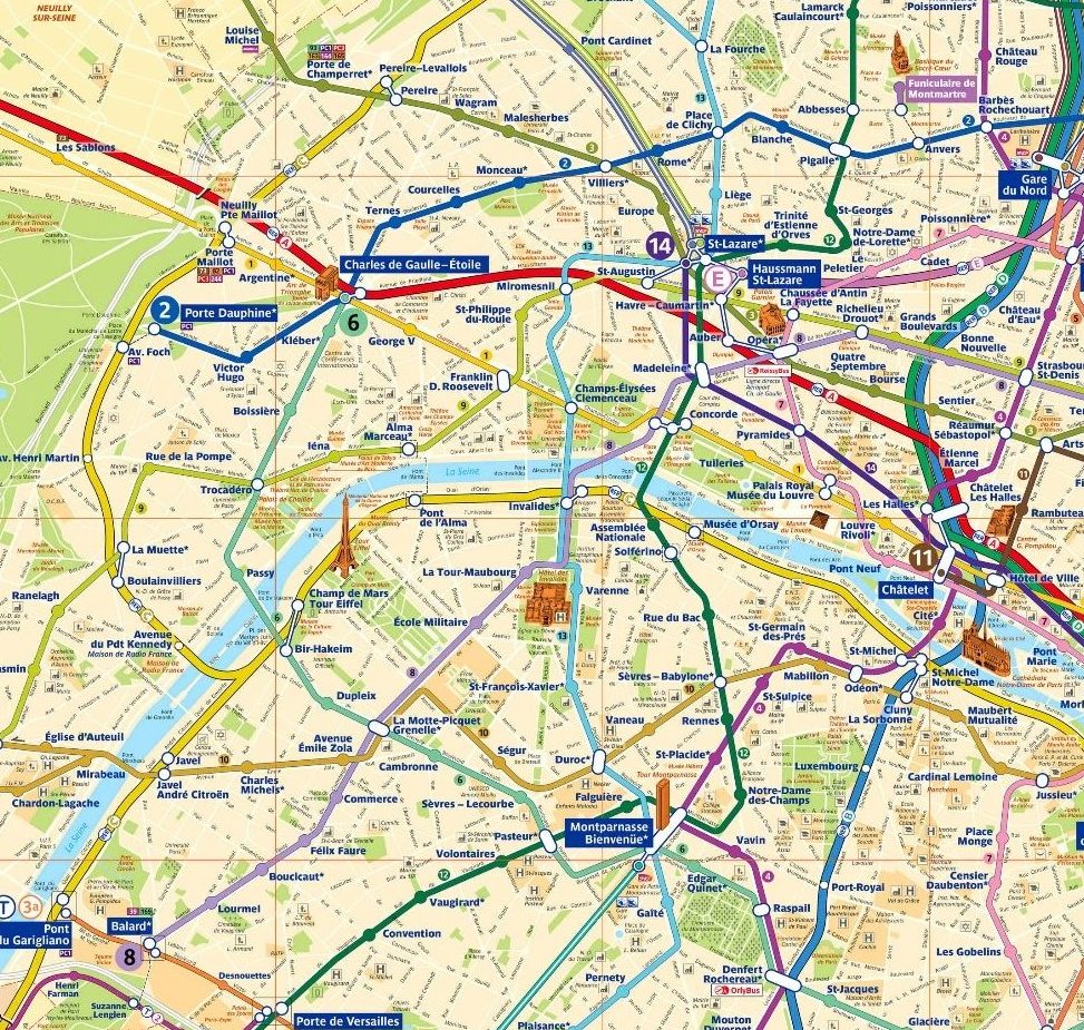
So what can be done to increase the pedestrian legibility of these widely-circulated system maps? The answer lies in having an additional map to the diagrammatic system map that including streets and blocks as muted yet crucial background information. Anyone who has spent more than two minutes talking with me knows that I’m a huge Francophile, and will roll their eyes when I cite the Paris Metro (RATP) as a good example of pedestrian legibility.
Yes, this map is busy and would make a minimalist cringe. But compared to the amount of information it conveys versus its American counterpart, it does its job well. Distance between stations and landmarks are much more obvious, as is the ability to easily deduce where lines go and where transfers take place. This map is a singular go-to guide for accessing Paris by foot and by train. The lines contrast with the background data enough where they are easy to focus on and follow, but the street grid and names are accessible if the user needs more information and contextualization. This highly informative map is complemented by a larger, more diagrammatic system map (like WMATA’s current Metro map) to meet different needs – those of people accessing the stations and those already within the system who need to navigate to their final destination. Both maps can be found in train stations across the city, and serve unique yet equally important needs.
The incorporation of street grids into transit maps is hardly a revolutionary idea – plenty of American transit agencies have district maps showing the local neighborhood in pedestrian context (such as the underground SEPTA trolley stations in University City, Philadelphia). Most system-wide bus maps show streets (e.g., the New Orleans RTA bus map, WMATA’s bus map), but these pedestrian legible maps are treated as supplemental information or tourism resources, which belies their true potential. System maps with these elements exist, but they need to be prioritized and treated as equals with their stylish diagrammatic companions when it comes to distribution and visibility.
I won’t cite Paris as an example without qualifying key differences between American cities and their European counterparts. European cities are overall denser and less sprawling, fitting more transit within fewer streets. To try and directly copy their example exactly could require huge amounts of space just to make the average block and street discernible on the page. The pure size of American cities makes fitting their street grid and urban footprint into a functional map an immense challenge – but one that I think is worth taking on.
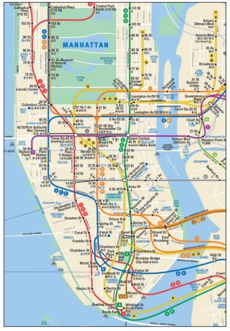
The New York City Subway map tackles this challenge with an interesting, hybrid approach: in the city’s most pedestrian-active areas (Manhattan and parts of Brooklyn and Queens), a simplified, reduced street grid with major arteries lies humbly in the background. While not quite as rich with information as the Paris example, this map still does a good job of helping the New York ignoramus (me) navigate than many other transit maps. It acknowledges the symbiotic relationship than subways and pedestrians possess, and strives to create a single map where shifting between those modes requires less thought and less reliance on other sources of information.
This identification and simplification of pedestrian infrastructure is one means of making a transit map more legible. Another is to use bright colors for transit lines, and muted colors for the street grid – the map serves as a general system diagram from a distance, but as a rich source of information if one takes a step closer. Finally, better integration of pedestrian and rail mapping is to create focused transit maps on smaller areas instead of the entire system. This provides the necessary real estate to create a map where the area of focus is at its maximum extent, and the blocks and streets can be shown in detail. The extents of the lines that go beyond the boundaries of the focused area can be shown as diagrammatic insets.
What next?
Reliable transit service is key to making a city less congested and more pedestrian friendly. But if transit maps don’t clearly highlight the scale and pedestrian proximities of their own systems, then this relationship is not being utilized to its fullest potential. I’m not suggesting the removal of clean, iconic system maps, but rather for a pedestrian-legible companion that receives equal billing.
Will busier transit maps make for the best minimalist artwork on Pinterest? Probably not. Will they better serve the people who ride those systems daily? Possibly. So, which is more important?
[1] https://www.gamasutra.com/view/news/263099/2016_Independent_Games_Festival_debuts_finalists.php
[2] http://www.archdaily.com/521438/washington-d-c-the-most-walkable-city-in-the-us
Image sources:
http://www.eutouring.com/paris_metro_maps.html
http://pixel.nymag.com/imgs/daily/intelligencer/2016/05/26/26-subway-map-1.nocrop.w536.h2147483647.2x.jpg