Thanks to a plethora of easy-to-use tools and experts who invest time in exploring them, good data viz practice is now an emphasis when communicating with expert and non-expert audiences alike. At Foursquare ITP, we do a lot of both: outreach to communicate data with stakeholders and the public and internal work with clients to pin-point possible system improvements using data.
Background
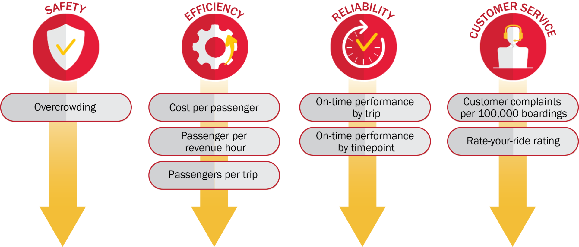
As part of our ongoing work on the BaltimoreLink system, Foursquare ITP has supported MDOT MTA by developing guidelines for bus service and performance monitoring. The performance monitoring guidelines include measures that reflect MTA’s goals, targets for those measures, a grading system, and a reporting process. Rather than relying just on static reports, part of the reporting process is a suite of interactive Tableau dashboards that show monthly measures for each bus route and service type.
The primary data source is MDOT MTA’s automatic passenger counters (APCs), a combination of hardware and software that tracks passengers entering and exiting buses. While the name suggests that the APCs only track ridership, the data can also be used to find revenue hours, on-time performance, and how crowded each bus is. Two other data sources include complaint logs from the Transit Information Contact Center and riders’ input in MTA’s Rate Your Ride website.
Choosing Tableau
It was easy to choose Tableau for this project.
- Tableau Software is over fifteen years old, so we knew the product wouldn’t be discontinued out of the blue like other start-ups or newer software.
- Tableau Desktop specializes in quick, attractive charts but also can be infinitely customized.
- Tableau Online allows for hosted server access, letting us create nightly refreshes to minimize needed maintenance.
- Instead of working through buggy software or manually updating the dashboards, we can use our time adding new features or analyzing new data sources.
Designing the Dashboards
Audience
The audience for this project was internal users at MDOT MTA, some with service planning role and some with general planning roles. This meant we didn’t need to walk through the implications of the data with our users, yet some data could be summarized (e.g. average passengers per trip) versus finer-grained (e.g. average passengers on a 8:00 AM trip). None of our users had experience with Tableau. For this reason, we kept many elements simple so that the attention was on the data.
Layout
We made multiple, individual dashboards to allow for a deep dive of the data and keep the presentation clean. Each goal has at least one individual dashboard, and some have more. We also kept navigation elements consistently placed so that new users were confident when using and switching between dashboards.
As a visual element on our simpler dashboards, we added a shapefile of CityLink, LocalLink, and Express BusLink routes to use as an interactive filter.
Branding
BaltimoreLink has strong branding, from its websites to its buses, and we wanted to keep that for the dashboards. We used CityLink’s colors for each route and used gray and red for LocalLink and Express BusLink, respectively. We also added header banners to make each dashboard distinct.
Charts
Aiming for simplicity, we stuck with bar charts for comparisons and line charts for trends. This allows our audience to understand the data intuitively rather than learning how to read new kinds of charts.
Analysis
As part of the performance monitoring guidelines, we developed targets for each measure. These targets are used as reference lines to show if a route or period is meeting the target.